Stop Choosing Makeup by Vibes: How Color Theory Can Finally Make Every Shade Work for You
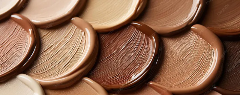
Photo: makeup swatches foundation blush lip colors diverse skin tones beauty, via img.freepik.com
We've all been there. You're standing in the Sephora aisle, holding a foundation up to your jaw, squinting under those unforgiving fluorescent lights, and making your best guess. You get home, put it on in natural light, and realize you look either slightly orange or vaguely gray. Back to the store it is.
The warm-versus-cool undertone conversation has been the go-to framework for makeup matching for decades, and while it's not wrong exactly, it's wildly incomplete. Color theory — the actual discipline that artists, designers, and colorists use — offers a much richer toolkit for understanding why certain shades make you glow and others make you disappear. And once you get it, shopping for makeup genuinely becomes a different experience.
Why 'Warm vs. Cool' Is Just the Beginning
Undertones are real and they matter. But reducing the entire spectrum of human skin to two camps does a disservice to pretty much everyone. The warm/cool binary also tends to flatten the experience of people with deeper or more neutral skin tones, who are often left working from a framework that wasn't really built with them in mind.
Color theory introduces a third category that changes everything: neutral undertones. People with neutral undertones can pull off both warm and cool shades without either looking off — which sounds like a blessing until you realize it makes shade-matching feel even more confusing without the right guidance.
Beyond warm, cool, and neutral, there's also the question of depth (how light or dark your complexion is) and hue (the actual color cast in your skin — pink, peach, yellow, olive, red, or some combination). These three dimensions together — undertone, depth, and hue — are what actually determine which shades work for you. Focusing on just one of them is why so many makeup purchases end up collecting dust.
Reading Your Undertone (For Real This Time)
Forget the vein test — it's a starting point at best. Here are more reliable ways to identify your undertone.
The white paper test: Hold a plain white sheet of paper next to your bare face in natural light. Does your skin look more yellow or golden next to the white? You're likely warm. Pink or rosy? Probably cool. Can't tell — neither stands out? Neutral. Slightly greenish or ashy? That's an olive undertone, which is its own category that often reads as neutral-cool.
The jewelry test: This one actually holds up. Silver tends to flatter cool undertones, gold flatters warm ones, and if both look equally good on you, you're likely neutral.
The sun reaction: Warm and olive undertones typically tan fairly easily. Cool undertones are more likely to burn before they bronze.
The shade that always works: Think about a clothing color that everyone compliments you in. Warm undertones tend to shine in camel, terracotta, and olive green. Cool undertones look amazing in jewel tones — emerald, cobalt, berry. If you look great in both, again — neutral.
Foundation: The High-Stakes Match
Foundation is where undertone mistakes are most visible, so this is where color theory pays off the most.
For warm undertones, look for foundations described as golden, peachy, or yellow-based. Avoid anything with a pink or rosy finish — it'll sit on top of your skin rather than melting into it.
For cool undertones, pink-based and rosy foundations are your friends. Anything too yellow will make you look sallow or muddy.
For neutral undertones, you actually have the most flexibility, but be cautious of extremes. A foundation that's very warm or very pink can still look off. Aim for shades labeled "neutral" or "N" in a brand's shade range.
For olive undertones, this is where most systems fail you. Olive skin has a green-gray cast that means both pink-based and strongly yellow-based foundations can look wrong. Look for foundations with a slight gray or beige undertone, or brands that specifically call out olive in their shade descriptions. NARS, Fenty Beauty, and Make Up For Ever tend to do this better than most.
The real swatching tip no one tells you: Swatch on your jawline, not your wrist or the back of your hand. Your jawline is where the foundation actually needs to blend, and your hands are often a different undertone entirely. Check it in natural light after five minutes — some foundations oxidize (turn darker or more orange) once they hit your skin chemistry.
Blush: Where People Make the Most Avoidable Mistakes
Blush is probably the most undertone-sensitive product in your bag, yet it's also where people tend to just grab whatever looks pretty in the pan.
Warm undertones look stunning in peachy, coral, and brick-toned blushes. A terracotta blush that might look muddy on someone else will make a warm-toned complexion look sun-kissed and alive.
Cool undertones tend to look best with rosy, berry, and mauve blushes. A true pink or a soft raspberry can be genuinely stunning.
Neutral undertones can go either direction, but a peachy-pink hybrid — think a soft salmon — tends to be universally flattering across neutral skin tones.
Olive and deeper neutral undertones often do well with warm terracottas and rich berries, but the key is intensity. Sheer, powdery blushes can disappear or look ashy; richer pigmentation reads more naturally.
Lip Color: Adapting Trends Without Losing Yourself
This is where the "I love that shade but it looks so different on me" problem lives. Color theory can explain why.
The classic red lip is a perfect example. A blue-based red (think classic Hollywood crimson) flatters cool undertones beautifully. An orange-red or brick red plays up warm undertones. A true red with minimal blue or yellow bias works for neutrals.
The same principle applies to every trend. Terracotta lips? Warm undertones will wear them effortlessly. Mauve and dusty rose moments? Cool undertones are built for this. The deep plum trend that cycles back every fall? Cool and neutral undertones typically carry it better, while warm undertones might want to add a touch of warmth by layering a sheer brick gloss over a plum base.
Adapting trends isn't about rejecting them — it's about finding the version of the trend that's been color-corrected for you.
The Bigger Picture
Color theory in makeup is ultimately about working with what you've got rather than fighting it. When your foundation matches your actual skin, when your blush looks like a natural flush rather than a painted-on stripe, when your lip color feels like it belongs on your face — that's the payoff.
It takes a little practice and some willingness to swatch thoughtfully instead of impulse-buying. But once you start seeing your face through the lens of color theory, the guesswork mostly disappears. And that's a really good feeling.